Uncategorized
Ode to Joy: In conversation with Nick Andrews
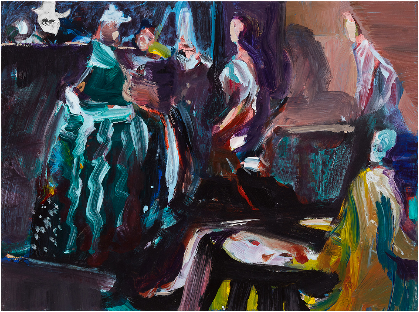
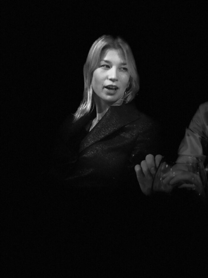
Ode to Joy: In conversation with Nick Andrews Since his first exhibition at the Black Panther in March 1997, Nick Andrews has been a constant force in the contemporary Antwerp gallery. His recent exhibition ‘Ode to Joy’ is the twelfth in line. He graduated from the Academy of Fine Arts in Antwerp in 1996. His work is characterized by his use of contrasting primary colors and flamboyant brushstrokes. This results in a pattern of light and shadows and a contrast between warm and cold colors. Nick draws inspiration from multiple fascinations such as film, theater, literature and philosophy.
“Ode To Joy” is an ode to color, to art and to togetherness. It is like life itself…”
Jeroen Olyslaeghers

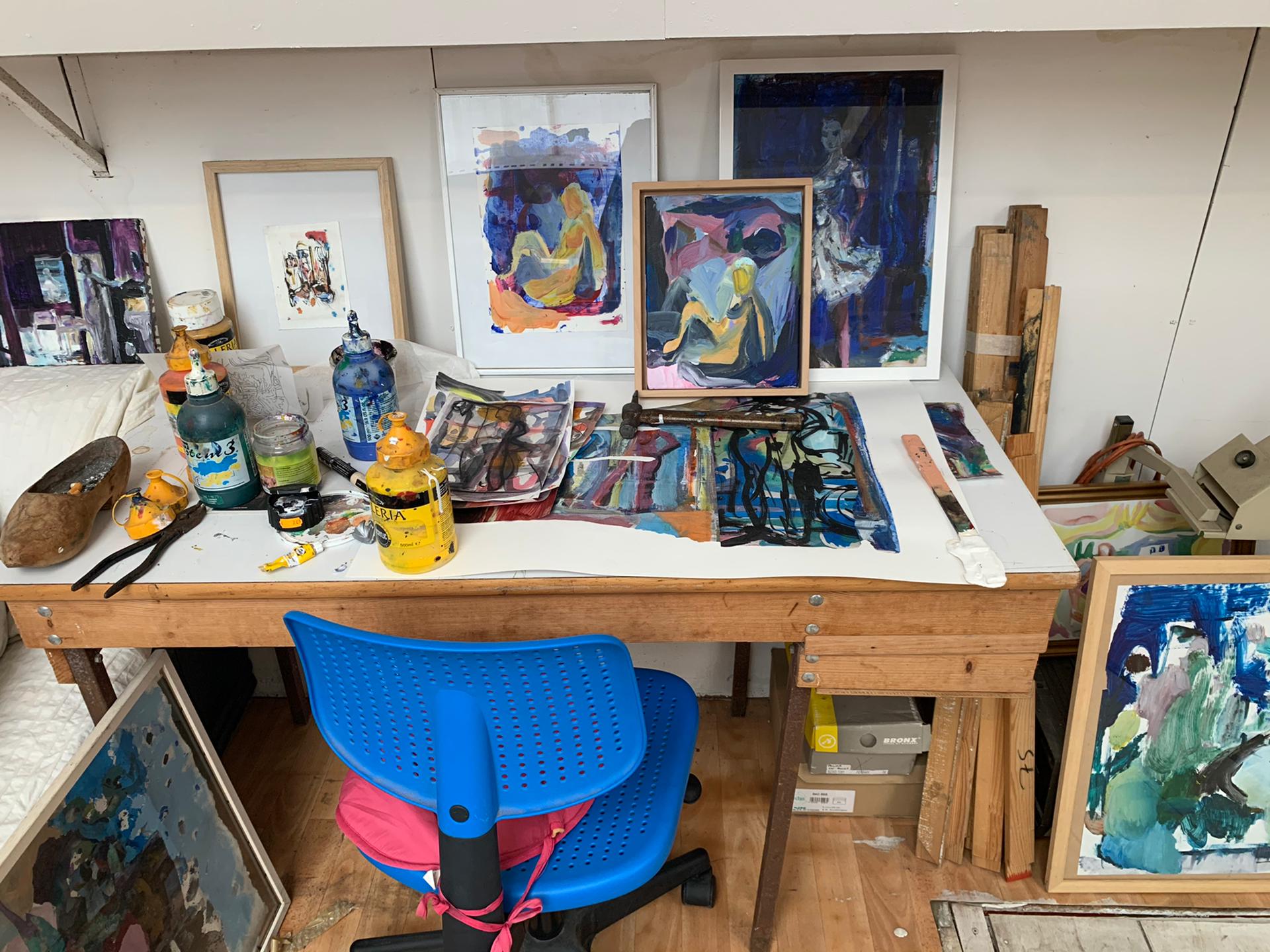
March 2021 – In the lime of a pandemic rampant outdoors, Private Art Tours sat down with Nick who was in full preparation for his exhibition Ode To Joy. Works under construction were hanging on the walls of his studio, compositions and color studies were scattered across his desk. We were given the honor of literally walking into Nick Andrews’ process of creation and contemplation and dug into the past of his life as an artist with great appreciation.
PAT: How did your relationship develop over time with Adriaan Raemdonck and Fred Bervoets?
Nick: “Adriaan was a member of the final jury during my studies in painting, I graduated in ’96. We were sort of the ‘Fred Bervoets’ class. I first intended to go to the Royal Institute for Theatre, Cinema and Sound (RITCS) in Brussels to do something more in the field of video, but in the end I decided to pursue painting. Before summer, I was invited by a teacher of Painting from the Academy of Fine Arts in Antwerp. He saw a certain aptitude in my gouache designs, so I was invited to come and paint. I went to museums a lot, but Rubens and other old masters put me somewhat off. After the summer break, I went to the RITCS anyway….. The first day at the introduction of the film school I wasn’t too keen. My mother saw that I wasn’t enthusiastic after all: in the end I took the entrance exam for Painting.’
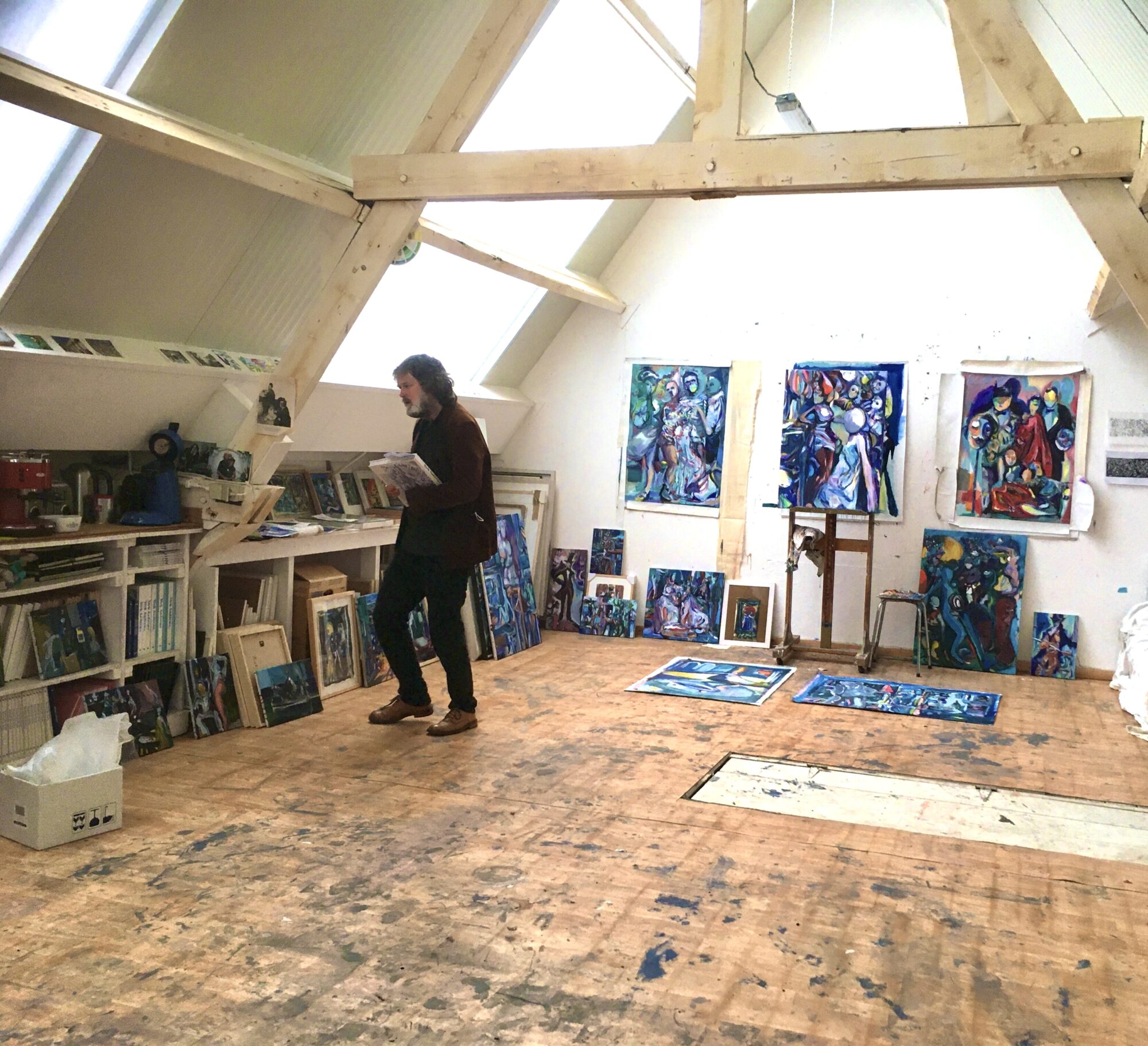
‘Two weeks after the entrance exam it was the first day of school with the selection group of the exam. All teachers were introduced and the last teacher was Fred Bervoets. We were a very close group and were very international. But still many people dropped out in the first year. Fred was interested in our mindset and works. He would regularly come around and say statements like ‘Nick don’t touch it’. You could see that he knew a lot about technique, he was very visual in his reading. He told us to work together as a group. Eventually we had rented a studio close to the Cogel Osyslei with eight people. We would have meetings by ourselves on Tuesdays. We started in October and since there were eight of us we called ourselves October Octopus. This is what led, 20 years later, to the exhibition “Dive Boat” in the long hall at the Academy of Fine Arts in Antwerp, coordinated by Sergio Servellon. ‘De Fred’ could speak very theatrically and had a poetic way of expressing himself; ‘I am your captain, we are going to sea, we are going under the ice!’ He passed this statement along to his students.’
‘During the time at the academy, you had a lot of these engagements and collaborations. Sergio Servellon sought out all these artist collectives that emerged from Fred Bervoets’ classes. We were the first one called October Octopus. Then you had Placenta with Nadia Naveau, Tom Liekens, Caroline Coolen and Bart van Dijck.’
PAT: Besides being colleagues, are you all friends?
Nick: ‘Before art, I used to do sports. There was a great deal of competitiveness there. In the art world there is also a lot of competition but I relate the competitiveness to my plastic dialogue in studio. Competitiveness in the art world is a part of a greater deal. But that part is different: it depends on how someone interprets it. In art, it’s completely different from sports. It’s a very strange phenomenon, you learn a lot from your works, you become a better person through something that is abstract or almost impossible to define.’
‘Anything can be art, but at some point there is something that has to be veneered, that can only happen through experience. ‘ Nick Andrews
Nick Andrews
PAT: Can you comment from each other’s work that is a strong piece? And why it is a strong one?
Nick: `Well yes, that’s mostly experience. My eyes are trained now, also through technique. When I was little my family came to Antwerp from England. We used to go to the Royal Museum of Fine Arts in Antwerp and I can always remember being frightened by Rubens. I enjoy it so much now that I can actually read Rubens. And also know how he constructed it, that he can create an incredible work with all the details in 6 weeks.
Once upon a time in the Royal Museum of Fine Arts in Antwerp there was a display rack where you could have a closer look at Rubens. You then saw that finesse and planning that Rubens did in 5 steps. By seeing plenty, you can learn from others, feel and see.
Anything can be art, but at some point something has to be veneered, that can only be done through experience.’
PAT: Have you ever reflected on a path that you haven’t thought about?
Nick: ‘A lot of people do the same thing all the time, but that’s their pattern. When I discover something, I don’t immediately know if it’s the right direction. But a good work always emerges.
That’s why I work in series. Also towards the exhibition. I have been working with Adriaan for a long time. He is a very open person, and I have always found the social aspect of his gallery interesting. The painters in his gallery appealed to me: it wasn’t a ’90s white space.’ Adriaan was always committed to your process: ‘You’re the maker, I’m the gallery owner, I can help you’. He made us do it until I got there. You had to work towards the exhibition. So I started working with series. I used to be a little more vital, then paintings tend to come faster sometimes because you are trying things out and testing stuff. Around your mid-40s you get a pattern, a way of working. A kind of handwriting, with me it’s about the three main colors, the organic, with a geometric design. I am expressive but coordinated. I read in relation to the material. I recognize that in the artists who have been working within the gallery. Painters working in the gallery were bold enough to speak out. Expressive works appealed to me. For the past 13 years I always had an exhibition in The Black Panther every two years. That was always around September at the opening of the season.
“I believe in the process and also in what the paint can do. I like to be surprised. Experimenting with different techniques and being amazed by them is what I like to do.” Nick Andrews
Nick Andrews
PAT: Your spouse is sculptor Nadia Naveau. Do you occasionally work together in the studio?
Nick: “Yes in her workshop we actually do. We also have a home and studio in Auvergne, France. This place is very essential to us. Sculptors work very plastic. Once it starts to take shape, then a different kind of process begins. Like an architect has to operate. Then comes the ‘gravity’, a certain technicity. But still I am happy to be a painter and to only have to think about, for example, elongating. Yet I feel the need to work around the artwork. I work with other techniques to give myself new energy. Lithography, etching, ceramics, carpet design…. Then I can return to painting. I revisit a series I was working on by linking it to literature and other certain fascinations such as philosophical aspects.
I have now also created a particular edition of porcelain works, of which only 25 were completed. Again, I have been painting with the three principal colors with an underglaze, so that you don’t immediately see what you are doing. You only see traces, but you don’t see the result. Our society is result-oriented with a big focus on deadlines. I believe in the process and also in what the paint can do I enjoy getting surprised. Experimenting with different techniques and being amazed by them is what I love to do.’
PAT: Your paintings have a very cinematic feel to them, can you elaborate on that a bit?
Nick: ‘I’ve always been fascinated by films and I always wanted to be a director. There’s an assignment I give to my students where we do scenography. What makes a painting autonomous, what is the difference between photography and film? How can you as a painter manipulate the viewer, by putting elements in the space. Some works of the old masters like Jan Van Eyck, Johannes Vermeer seem cinematic in which you are sucked in. In the beginning I have an idea that is abstract: it’s elements that start to emerge. Then it all comes together and becomes a scene.’
The exhibition ‘Ode To Joy’ runs until Sunday, November 7, 2021.
Galerie De Zwarte Panter | Hoogstraat 70-72-74 | Antwerpen | België
Thursday, Friday, Saturday, Sunday 1:30 p.m. to 6 p.m.
World Fair ’58
Regional modernism part 1
Wim Aerts
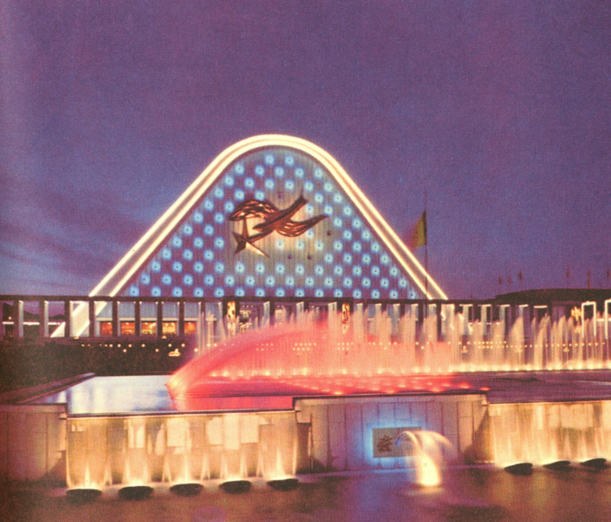
We are going on the architecture tour! In ’58 Belgium was all about innovative architecture and construction methods. Even today, the Expo ’58 pavilions continue to stir the imagination, with names like Le Corbusier, Renaat Braem and Leon Stynen making us long for those architectural heydays!
Reinforced concrete and steel structures become part of everyday architecture and are expressed in pavilions such as the ‘Atomium’, the ‘Philips pavilion’ and ‘the arrow of civil engineering’.
Dive into this fiercely debated style period with us and discover more about Expo ’58 in two parts!
1. Situation
During the fifties, Belgium was processing the aftermath of World War II. The face of our country changed and the way of life evolved thoroughly. The era of the consumer society began and numerous new products appeared in Belgian homes (televisions, washing machines, etc.).
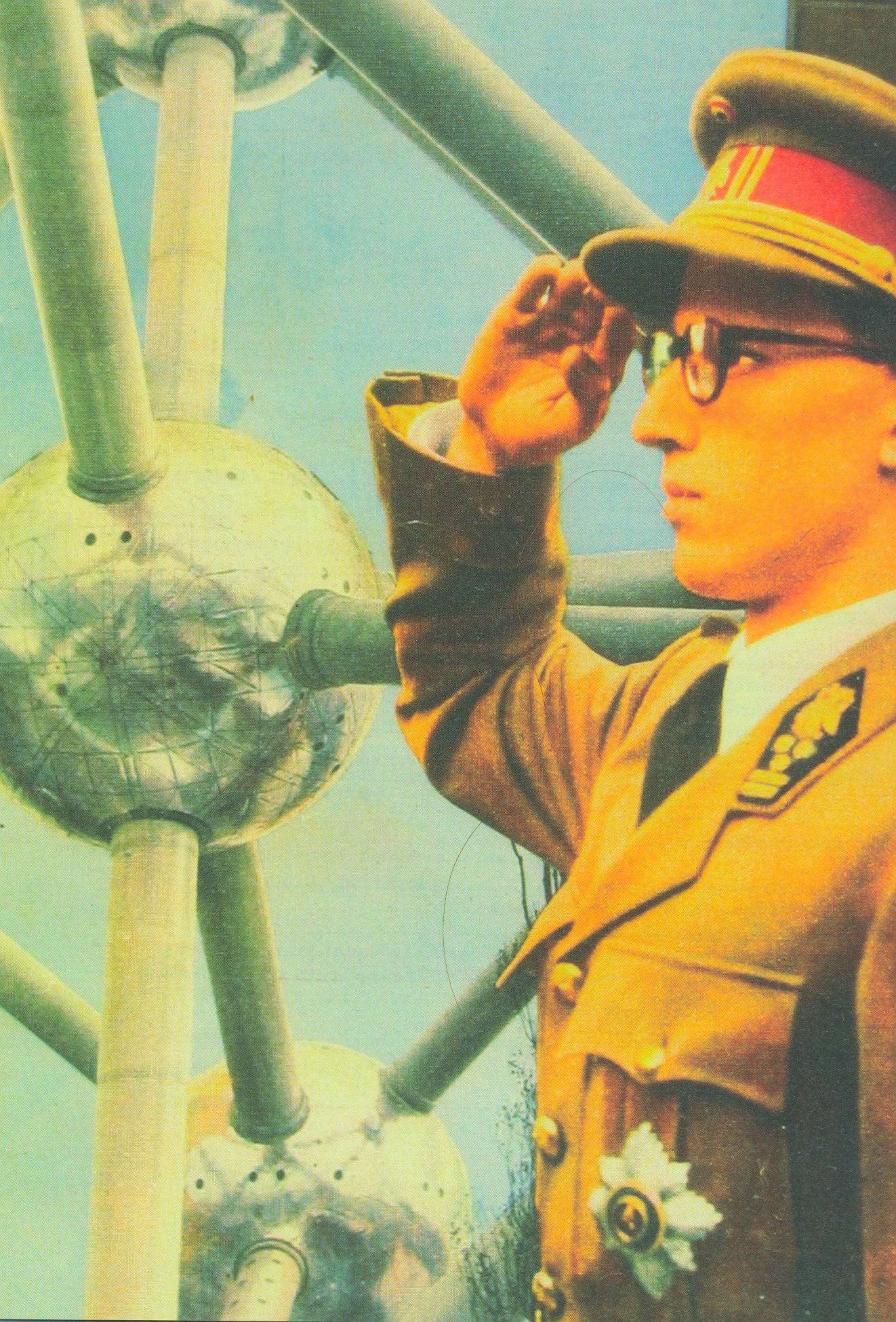
With the World Expo of ’58, Belgium wanted to focus on the future. The theme of the Expo was human beings: Balance of the world for a more humane world. But nuclear energy would also occupy an important place at the Expo, this with the atomium, to help rid it of its negative image.
Not only Belgium wanted to host this exhibition, but France and Great Britain were also candidates. Exactly 100 years after the very first World’s Fair, Great Britain wanted to hold it again in 1951. But the shaky political and economic situation meant that it was repeatedly postponed.
It was not until 1953 that registration for the Universal and International World’s Fair in Brussels officially took place in Paris.
In the later years there would be more political stability, and the wars were left behind. To promote better cooperation within Europe, various international treaties were concluded.
There was a lot of discussion surrounding the event of Expo ’58. Nevertheless, there was not yet complete political coherence; the Cold War was a game changer.
The architects of the time were highly critical of the exhibition. According to them, the architecture on display was not very innovative, and did not sufficiently reflect the new climate within Europe.
However, the Expo was seen as a celebration of new technologies. With the application of prestressed concrete, glued and laminated wood, steel bridges and tensioning and suspension systems, a variety of pointed round, spherical and block designs were on display. Innovative and new materials such as Plexiglas, polyester, hardboard and aluminum proved ideal for the construction of lightweight and temporary structures. Examples could be found in numerous pavilions of the Belgian sector, those of France, America, Russia,…
he World’s Fair didn’t just stand for architecture and exhibitions. It was a veritable style icon. The entire design of the event radiated joy and liveliness. In this way, an attempt was made to leave behind the dark period of the Second World War and to reintroduce optimism. A lot of color and new shapes introduced the expo into advertisements and brochures. This created a real collector’s mania around the expo ’58 and all the gadgets that were published about it.
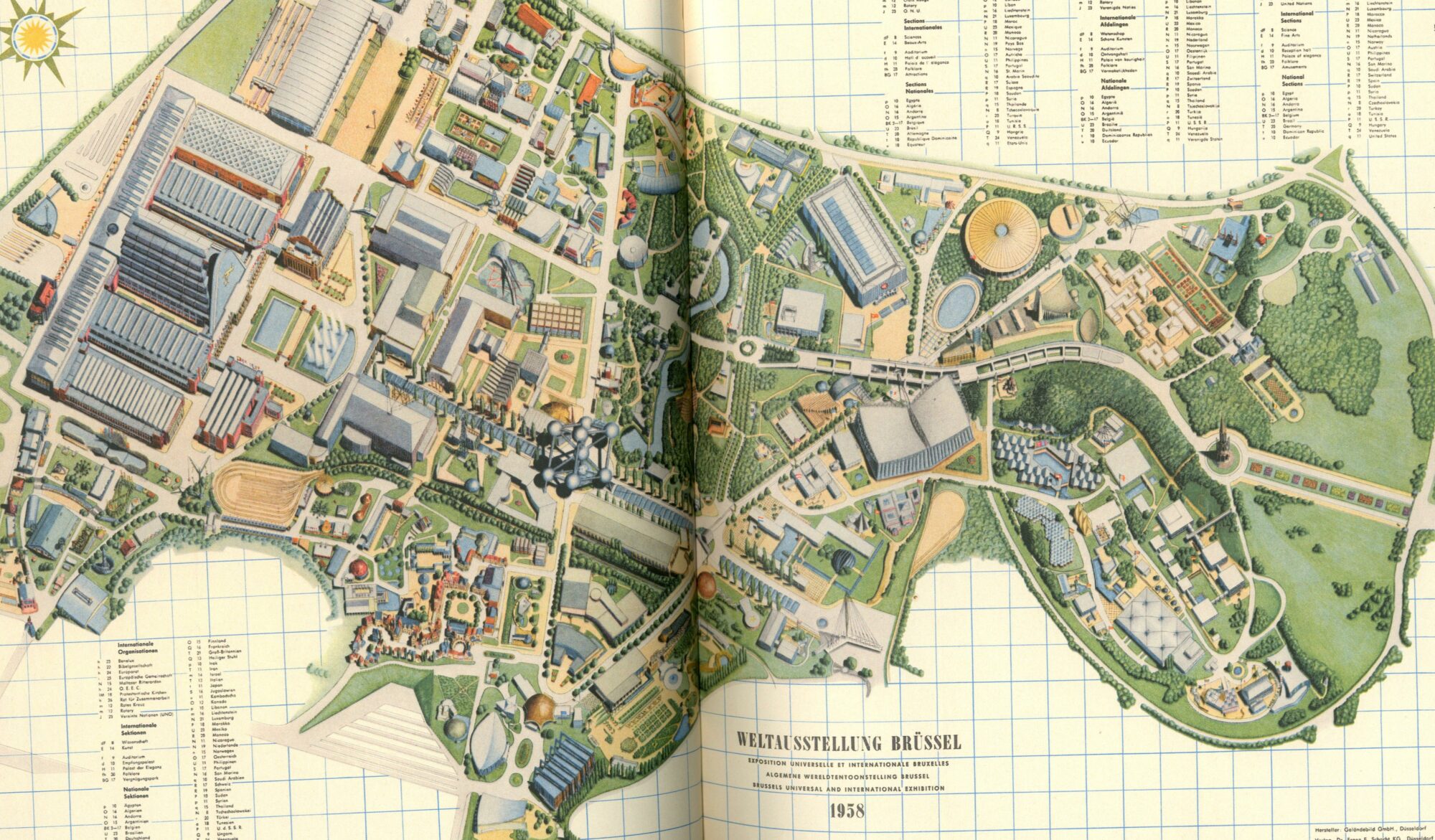
Brussels had to undergo many changes to prepare for the arrival of the World’s Fair. The entire city was occupied with demolition and adaptation works. Great efforts were also made in terms of accessibility. The main thoroughfares and access roads were redesigned; avenues of the inner beltway were widened, the streetcar was given its own bedding, Brussels was equipped with additional tunnels. But also the national airport of Zaventem was built. Brussels, the crossroads of Europe, would turn into a construction site for many years. It is often said that nothing disfigured the city of Brussels as much as all the works that were carried out to make it accessible for the expo. Some 30 million visitors were therefore expected for the World’s Fair. In the end, about 42 million visitors were registered.
The ’58 Expo continued in the same place as the ’35 Expo.
More than 160 Belgian architects participated in the construction of Expo ’58. Architects from the exhibiting companies, engineers and interior architects all contributed. For these architects, but also for the construction industry in general, the scale and diversity of the undertaking presented a particular challenge. The World’s Fair was of unprecedented prestige, Belgium, the participating countries, firms and architects exhibited themselves and their work.
2. Technical Progress
The great technical progress that was to be shown at the expo was evident in almost all the pavilions. Notable innovations in structures are found at:
The Atomium:
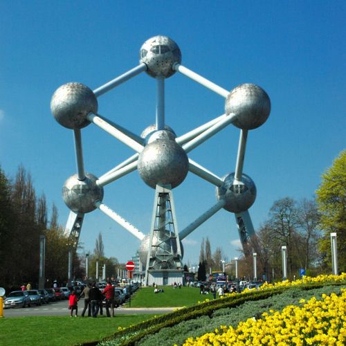
The Atomium was considered the central beacon of the exhibition. It stood for the great advances in science and is one of the first megastructures in Belgium. This peculiar building was designed by the engineer Waterkeyn and was drawn by the architects Polak. Structurally, they worked with triangles to obtain rigidity. The exhibition spaces were located in the different spheres. The large tubes that form the connections between the different spheres serve as circulation spaces. It is a very spectacular structure, but has a rather robust character. The Atomium combines new techniques with craftsmanship. Everything had to be made to measure. The building is one of the best known architectural works in our country, but is laughed at by many architectural circles. Usually it is discussed in overviews of design, as a lemma “kitsch” or as an icon of the atomic style. The structure was at the heart of the exhibition, and thus occupied a very central place during the Expo. This was a deliberate choice because nuclear energy played a major role in the exhibition. This building, too, was really only meant to have a temporary life. Nevertheless, the building is still used as a museum, restaurant, etc. It was recently completely renovated by Conix Architects. Many things are said about the architecture of this building, but above all it wanted to be a symbol. Of the emerging innovations, sciences,…
The arrow of civil engineering:
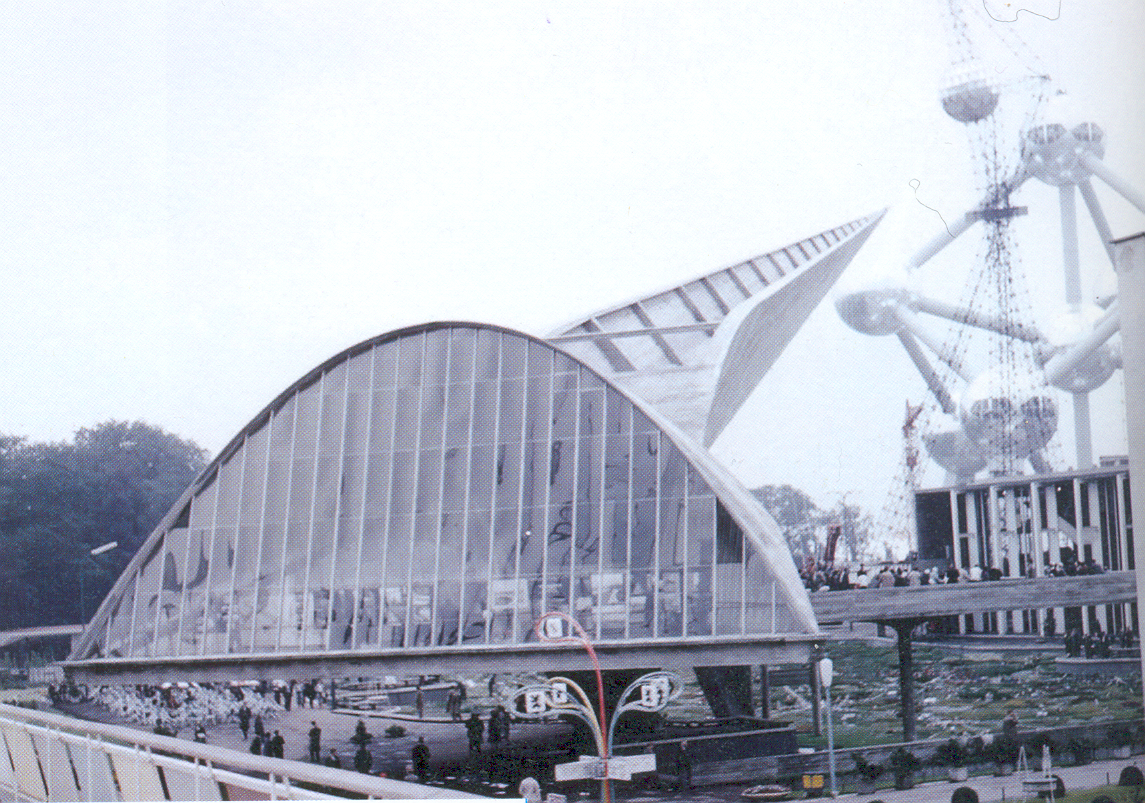
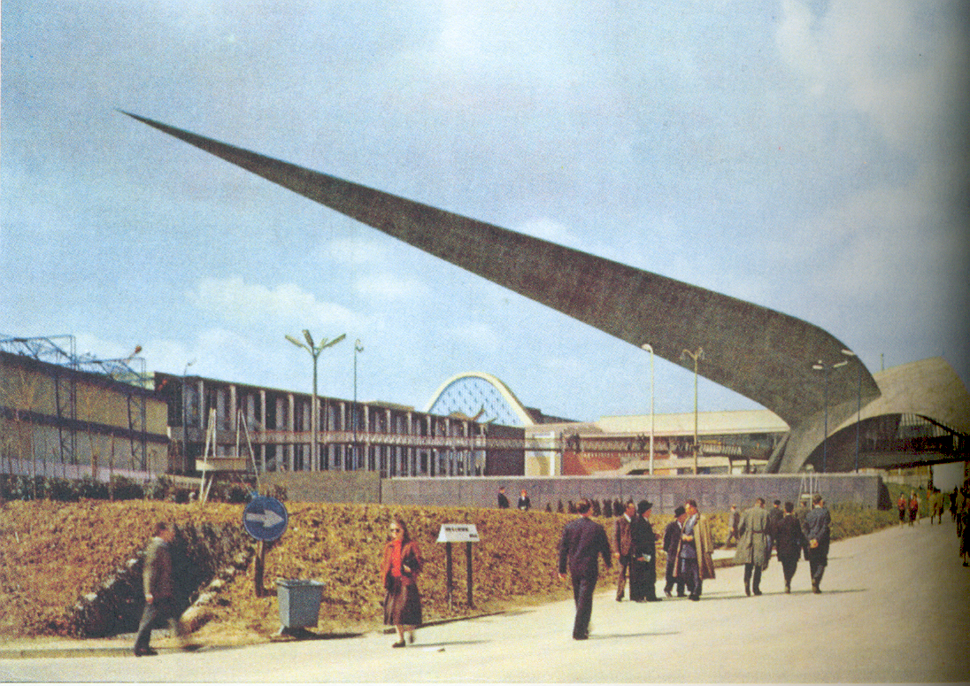
The plastic silhouette of this building was designed by the artist Jacques Moshall in consultation with an engineer. This building demonstrated the possibilities of reinforced concrete. This method of construction was very popular at the expo. There were several other pavilions at the expo that were made of concrete shells (just think of Nervi). In this construction method, the concrete is pushed to its limits, as it were. A gigantic arrow crowns the pavilion, as it were. The dominance of the arrow is all the greater because of the modest size of the pavilion itself.
Information pavilion on Place Brouchère:

What is characteristic of this pavilion is the fact that the entire roof structure rests on only two supports. The roof is constructed with wooden laminated beams. This allows the thickness of the roof to remain limited. This is a technique that was developed at the workshops of De Coenen. These have executed several pavilions for the expo. The shape of the scaled roof is based on mathematical functions. Two symmetrical axes largely determine the appearance of the volume.
3. The different sections of Expo ’58
The new world of 1958 was well experienced at the exhibition within the different sections: namely, the Belgian section, the Foreign section, the International section, the Colonial section, the amusement park and the Commercial section.
For the first time, supra-national institutions were represented, housed in the global section. The palace of international cooperation and the pavilions of the UNO, ECSC, Benelux, OEES and Council of Europe were gathered around the square of international cooperation. The interconnectedness is emphasized by the architecture and by the similar approach to the tectonic aspects. Such as light materials, and new construction methods.
A contemporary expression of unity was also sought in the Belgian and colonial section. This section took up almost half of the total area of the exhibition. Jean Hendrickx -Van den Bosch and Maurice Houyoux-diongre were appointed as chief architects of the Belgian and Colonial sections. In the Belgian section, the aim was to place grand, but ultimately monotonous pavilions that could compete with the Heysel palaces. The Colonial Section was given a central place in the exhibition between the Benelux Gate and the Atomium, and was crisscrossed by several important avenues.
The chief architect of the Foreign Section was Marcel Van Goethem. Within this section there were no guidelines for form. A kind of unity through diversity was put first. The evolution within modern architecture showed its many faces at the exhibition site. Most of the 48 participating countries opted for modern architecture. Just when this modern architecture was being presented at a world exhibition, it was declared dead as an “international style”.
The Belgian section:
The Belgian section was located at the Heysel Palace, which received a temporary new facade for the occasion. This radiated the new tectonics. During the day the exhibition had a great radiance, but also at night it was so. The whole exhibition was illuminated, which was quite new for that time. It thus took on the appearance of a metropolis.
Pavilions: Atomium, The arrow of civil engineering,… (see introduction)
Source: Modern architecture at expo 58, Rika Devos, Mil De Kooning
Want to know more? Discover it soon in part two!
The Insider & Kate Maveau
Let us get acquainted with the woman behind our amazing videos and pictures! When she graduated as a film director at Rits, Brussels, her ambition and curiosity brought her to peculiar places in Wales and Berlin. Besides film, her passion includes photography, dance and music too. ‘ Composition, Colour and absurdism are, alongside surrealism, keywords in my work.’ In our new Insider we interview director, writer and composer Kate Maveau.
– How did you decide to become a director and the Rits in Brussels?
I grew up in a small village in Belgium. I always felt too peculiar to fit in and my curiosity was much larger than I anticipated. I adored beauty and therefore I was eager to expand my horizon. When my mother enrolled me as a nurse, I rebelled. I entered the entrance exams at the Rits and got accepted.
– How did the Newport film school (Now the University of Wales) contribute to you being a director?
At first, I was disappointed in the film studies at the university. The quality of the Master’s degree failed to impress me. However, after several weeks, I met some of the most interesting people. To this day, I consider these people my closest friends. They help me grow and reflect, not only on a personal level but also on my cinematographic work.
– Is there a main difference in film between Belgium and the UK?
I feel it depends on how you look at the film. In many aspects, it is the same. To be honest, I am still at an entry-level when it comes to film in Belgium. There are so many different genres and both Wallonie and Flandres tackle each in a different style. While each country has its own house style, mainstream pop culture is following similar fashions.
“I construct fictional stories from personal experiences, an incident or a feeling. This brings me closure after certain grievances. I give it a context. It’s how I capture the moment and how I make it mine forever.”
– Your short film SHIMI has played at multiple festivals. What is the film about and where did you draw your inspiration?
Yes true, I was fortunate that SHIMI played on several festivals like ‘Independent Days’, ‘Serile Filmului Gay’ and ‘Scenic Film Festival’. The film was also picked up by the discovery platform FilmDoo that let the film travel the world. SHIMI is about Keely, a lonely sixteen-year-old teenager and ballerina, who meets Mairi, an eccentric and attractive girl who is her complete opposite. As the pair are drawn closer to one another, Keely’s limits of desire and self-control are put to the test. The inspiration for the film is drawn from sentiments I experienced during an intimate friendship.
– Are there similarities between your projects?
I construct fictional stories from personal experiences, an incident or a feeling. This brings me closure after certain grievances. I give it a context. It’s how I capture the moment and how I make it mine forever.
– For Private Art Tours you’ve created some fun and creative promotional video’s. (you even created the music) Are there major differences with your own work?
There is definitely a difference between my own work. Although, the lines get blurred when I have autonomy on a promotional video. I experiment and think about how to approach a subject differently. As with promotional video’s the emphasis is rather on selling the product. Fiction and experimenting with imagery remain my biggest passion.
– Do you look up to someone?
Ever since I was an infant I was definitely fascinated by Marie Laveau and Mary, Queen of Scots. Both women have intriguing backstories. They differ a great deal and therefore inspire me in distinct and unusual ways.
In addition, I am a massive fan of East Asian cinema. I love it when there’s great care in composition and colour like in ‘Hero’. I’m living for the film ‘2LDK’ which has many absurd elements. Composition, Colour and absurdism are, alongside surrealism, keywords in my work.


– What’s the next step? Are you working on anything new?
I’m currently writing a short script called “A Bird’s suicide”, and I’m brainstorming a documentary about Ethiopia. Ethiopia is a poetic documentary about Ethiopian people who all live in Belgium. This poem begins with Naomi, an art conservator, who was adopted as an infant. She aspires to share her knowledge with local people on how to conserve the Ethiopian cultural heritage.
A bird’s suicide is a short dark comedy about two psychopaths who hunt each other and fall in love.
Stay in touch with Kate, check her newest website
The Insider & Ana Zoe Zijlstra

Art, literature, music, politics… socially and culturally this Insider is hugely educated. Ana Zoe Zijlstra is an art scientist and has already pursued an entrepreneurial and distinguished career. Every day she dedicates herself to the powerful art gallery Xavier Hufkens as Associate Director. Private Art Tours spoke with her!
PAT/ Hello Ana Zoe, we know each other for a long time and although it doesn’t seem so at first sight, your roots are situated outside of Belgium. Could you explain to what extent this has shaped you as a person and how this influenced your view as a woman in Belgium?
AZ/ I moved to Brussels when I was fourteen. Although we only crossed the national border, moving from a medium-sized village to the capital of Europe at such an age had a significant impact.
It meant a broadening of my horizon of understanding at an age when I was developing myself. Although I went to a Flemish-speaking school, almost all my friends were of non-Belgian origin: Spanish, Syrian, Moroccan, Greek, Lebanese, you name it! That was a first awareness. This led to the discovery of Brussels as a city and its many characteristics. The high concentration of art galleries, multitude of concerts and accessible cultural excess not only helped to ground me, but also supported my choice to study Art Sciences. Without it, I might have gone in a completely different direction.
PAT/ In times of a pandemic, we all realize how the absence of culture can feel like a loss. How unique is the cultural world to you on a day-to-day level?
AZ/ Culture has been a big driving force for me this past year. While the “IRL” experience may have had to suffer for a while, digitization has made a lot more convenient. Suddenly everything was accessible with one click: concerts could be watched and listened to online, there were podcasts, art collections and exhibitions I viewed through a screen: everything was being posted online. And suddenly there was time for all of it! From my living room I observed, heard and learned an enormous amount. So on that level it has really been an internalizing process. On the bright side, I have developed a very healthy appetite for “real” life, a renewed joie de vivre.
PAT/ Why do you dedicate yourself every day to Xavier Hufkens. Can you explain a little bit for the reader what your position entails?
AZ/ An art gallery has multiple roles, both visible and invisible: supporting artists and their careers. Often it goes beyond organizing exhibitions, promoting artists and selling art; we provide all kinds of services : publishing books, talks, etc. We facilitate, so that the artists can concentrate as much as possible on their work.
More precisely, is my job ambiguous: on the one hand I am press attaché and responsible for press and communication within the gallery, on the other hand I work closely with artists represented by the gallery.
PAT/ Are there any exciting projects you are currently working on at work? Something in the pipeline that you think is definitely worth explaining?
AZ/ With the gallery, we are soon to break into a new chapter. We are renovating and tripling the historic gallery space in Ixelles. Architecturally, it’s about a spectacular design, but there’s so much more to it than that. It’s also a time to think about many other aspects, to ask the right questions, to think about the future and so forth. These are exciting times!
“An art gallery has multiple roles, both visible and invisible: supporting artists and their careers. It often goes beyond organizing exhibitions, promoting artists and selling art.”
PAT/ What gives you daily energy to accomplish what you do?
AZ/ Enough sleep! Stepping away from art once in a while – through books, close friends and family or sports – helps to keep me refreshed and with healthy energy.
PAT/ hat are your great examples in the art world right now or who is helping to shape your critical eye and framework of reference?
AZ/ I admire people who are good at looking beyond the obvious and making new associations. I have learned a lot from people like Alex Ross, David Van Reybrouck, Malcolm Gladwell, Joost Zwagerman, Simon Schama, Richard Dawkins, Carel van Schaik and Kai Michel.
PAT/ If you would close your eyes for a moment and had all the money in the world in your hands with the best people, no compromises where would you like to go in the world and with whom?
“Be responsive, creative and receptive. Watch, read and absorb and make sure you keep learning. Have one eye on the past and one eye on the future.”
PAT/ What advice do you have for future art scholars or do you have a golden tip for new professionals in the art world?
AZ/ Be receptive, creative and receptive. Watch, read and absorb and make sure you keep learning. Have one eye on the past and one eye on the future.
PAT/ Thank you Ana Zoe, we are very happy to invite you to one of the next Private Art Tours events! Who is your ideal date for a Private Art Tour?
AZ/ That’s a tough one to choose! Roberta Smith, Ann Temkin, Caravaggio, Michelangelo, David Van Reybrouck or Giorgio Locatelli. But of course, Naomi Meulemans and Giovanna Tamà!
The Insider & Vera L’Ecluse
Each month The Insider at Private Art Tours explains the world of an art expert, this time we get to sit down with Vera L’Ecluse, Gallery Relations Coordinator at the powerful contemporary art fair Art Brussels. What makes an art lover an art expert? We were easily convinced by Vera’s fascinating stories. Vera L’Ecluse seen through the eyes of her friends could best be described as ‘top woman’. Private Art Tours continued its research!
– First of all, who is Vera behind the job?
VERA: (smiles) I see myself as an ambitious person, especially in order to achieve results in my work because it gives a great feeling of satisfaction. Now that I am getting great opportunities, I’m fully set to do something with them. Although I also discovered that it is necessary to be patient, without asking too much. Furthermore, I am a go-getter and I have noticed that mini-passes can be just as important. Although it sometimes asks to make yourself a bit invisible, I will always go for it to achieve a common goal set by the team. If the result is there I don’t mind working in the background at this moment in my life. Outside of my work I enjoy art and seeing beautiful things. Being together with family and friends can truly do me well.
“Galleries play an important role between museums and artists and a good gallery confirms this.”
– You’ve come a long, interesting, way in your career, how did you end up at Art Brussels?
VERA: Through a friend, Katinka Vandevelde, I was once asked to help at the fair last minute, this was mainly about unpacking works of art and assisting the artists on the spot. Everything ran very smoothly and operationally I was able to cooperate a lot. The people I had worked with put in many good words afterwards and so I was able to start at VIP Relations. It was all very coincidental but at the right moment, because I was out of a job and had previous gallery experience. So it seemed like a good combination.
– A wonderful new challenge?
VERA: For me it was great to be on the other side of things during Art Brussels. VIP Relations is working for a year on a schedule to provide the most exclusive experience for the VIPs during the 4 days of the fair. It wasn’t necessarily what really got me passionate because you have less contact with the galleries and the artists, but it was a very interesting experience.
Last year I was asked to work more within ‘Gallery Relations’ as a Gallery Relations Coordinator which is a very beautiful position for me. Many people see galleries in a dubious role and believe they only want to make money at the expense of the artist. But that’s a serious misconception, without galleries many successful artists probably wouldn’t exist. There is more to a gallery than making profit. Galleries play an important role between museums and artists, and a good gallery confirms this. Unfortunately, there are also many gallerists who are only focused on making profit. Which is understandable because running a gallery is extremely expensive.
“Belgium has a reputation for attracting the largest number of collectors per capita. On top of that, the Belgian collector is known for his hunger for up-and-coming, as yet unknown artists”.
– Why do you prefer to work for a fair? and not for a gallery?
VERA: Personally, I wouldn’t want to work for a gallery anymore because it’s such an intensely personal matter. It’s very difficult to work in someone else’s gallery and love all his/her artists and defend their work. The only “solution” would be to open a gallery yourself, then you know for sure that you can stand as a block behind every artist on the roster. Who knows, maybe one day.
So it’s great to be able to work in the role of gallery relations at Art Brussels. You’ll discover an enormous number of artists and can learn a lot from the various gallerists. What fascinates me most here are the stories about the art and artists of the gallerists themselves. After all, some gallerists are fiercely loyal to their artists and sometimes continue to support them throughout their careers, through both the thick and the thin, which is really admirable. I think it’s great to gain so much insight into this.
Our primary role is to sell a booth to gallerists, but we also try to make this a worthwhile experience and show this to the gallerists with great enthusiasm. We want to make it perfectly clear that Art Brussels brings top gallerists together and we also ask them to work innovatively. We encourage them to arrange solo exhibitions in which one artist stands in a central position. In this way, we want to remind them that the ‘content’ of the gallery contributes to the quality of the fair. We also organize artistic projects ourselves, for example by inviting one (or more) artist(s) to set up at one of our sponsor lounges.
“Art Brussels is more than ‘selling’ and helps the gallerists to exhibit interesting combinations of artists. In this way we want to present a long-term vision and always deliver top quality content”.
– Are these the good times for Belgian artists?
VERA: I think more people get a voice and there is much more diversity to be seen on the Belgian art market. For example, a few years ago Outsider Art was not as visible in Belgium as it is today. It’s certainly an exciting time in which a lot is possible.
– What makes Brussels an interesting art hub? What keeps you here?
VERA: Brussels has the big advantage of bringing together a lot of artists in a relatively small area. This makes the city a strategically cosmopolitan place close to other major hubs. Belgium has the reputation of having the highest number of collectors per capita. Moreover, Belgian collectors are known for their hunger for emerging, as yet unknown artists. Art Brussels is doing very well when it comes to international artists. Belgium has a grateful audience, they are interested in young artists. We even have a separate section for them at Art Brussels, Discovery, and we see that it is a success. The gallerists also express that Belgians are a social audience; they come to tell us that there is a lot of conversation with gallerists and that people are curious about unknown artists and galleries. We are dealing here with a modest but serious and captivating audience.
– Since March we all bear the consequences of the Corona virus, Art Brussels was postponed to April 2021. Is there a ‘Corona Effect’ on young artists and gallerists?
VERA: We have noticed that large galleries continue to sell well, but for small gallery owners this is not at all that obvious. The low turnover due to the virus naturally has a major impact on the smallest galleries. For many, this means less budget to support artists’ projects. Unfortunately, most galleries are relatively small in Belgium.
– Corona Effect on Vera?
VERA: Initially, I had one big worry; that I was going to lose my job. Besides that, it was just a great shame that a beautiful moment, the fair itself, couldn’t go ahead. In the meantime, it has become clear that every crisis is indeed a challenge: we will have to completely reinvent the concept of the fair and see how it can be done safely in terms of social distancing and paying extra attention to hygiene, without sacrificing the festive connection between gallerists, collectors and artists.
– Reinventing is not always easy, how do you take this challenge?
An important initiative that we are launching during the recent crisis, in collaboration with Gallery Viewer, is an online viewing room. By doing so, we want to give our galleries the opportunity to connect online with our VIPs and visitors and hopefully also sell some work. The difference with other online platforms – because nowadays every art fair offers something similar – is that ours will be open for a relatively long time (almost three weeks) and that we encourage our galleries to change their selection on a weekly basis and always try to present a thematic selection or a solo presentation. As a result, we will continue the high standards of our fair online, i.e. well-organized and curated presentations. By discovering new things every week, we hope to keep the attention of our online visitors and trigger them to come back several times (while on most platforms only the first day is a hit). Our platform will be launched on May 28th at 11am and will remain open until June 15th. You can easily access it without having to register (also an innovation! this is a low barrier!) and you can find the access button from the 28th of May on the homepage of our website.
– So ‘Flattening the curve’ also includes a positive effect on you?
VERA: Oh, yeah! I don’t have to commute to work, which was a serious commute of an hour and forty minutes to and from work. I now have time for a long walk of an hour and a half every night. At home we cook a lot more and you don’t feel like you are missing something, because there is nothing! No more overdrive, no fear of missing out! But I do look forward to taking some of it back, I miss my colleagues very much. In the future I certainly hope to go back to concerts and I am really looking forward to visiting exhibitions again.
– Do you have any ‘lock down’ tips for us?
VERA: I love to read novels, and actually only novels, because I enjoy them so much. Recently I read the wonderful book ‘The Hare with the Amber Eyes’ , which is about the family of artist Edmund De Waal. The story about a wealthy Jewish family in the 19th century intrigued me enormously. The family collected precious Natzuke, Japanese handmade pearls from precious materials that are used to hold clothes together. The pearls are works of art in themselves and were still collectable at that time. The book describes how the collection goes from one family member to the next and so you can learn more about the family history. This story brings together everything I’m curious about, Jewish cultural history, art history and recent European history in one very good book!
“Some other books I also enjoyed; The Travelers by Regina Porter and Austerlitz by W.G. Sebald.”
– Vera after the lock down?
VERA: Corona or not, parents are important! I try to visit them by bike that’s an hour and a half ride there and then back again. The galleries will open in the week of May 11th and I will be happy to visit them again. But apart from that I haven’t planned any great things, I’m not really eager to go on vacation. Speaking and seeing people in person, that’s it!
Connect with Art Brussels at www.artbrussels.be. Also follow #onlineexhibitions on social media like Instagram and check out the exhibitions that were ready to be seen! Art Brussels is an art fair for contemporary art and is part of the larger fair company Easyfairs. Vera works in a permanent team of seven members, during the fair this can be up to 150 people. As a result of COVID-19 Art Brussels was postponed to 22 – 25 April 2021 all information can be found on the website.
The fluorescent dream: the journey of research

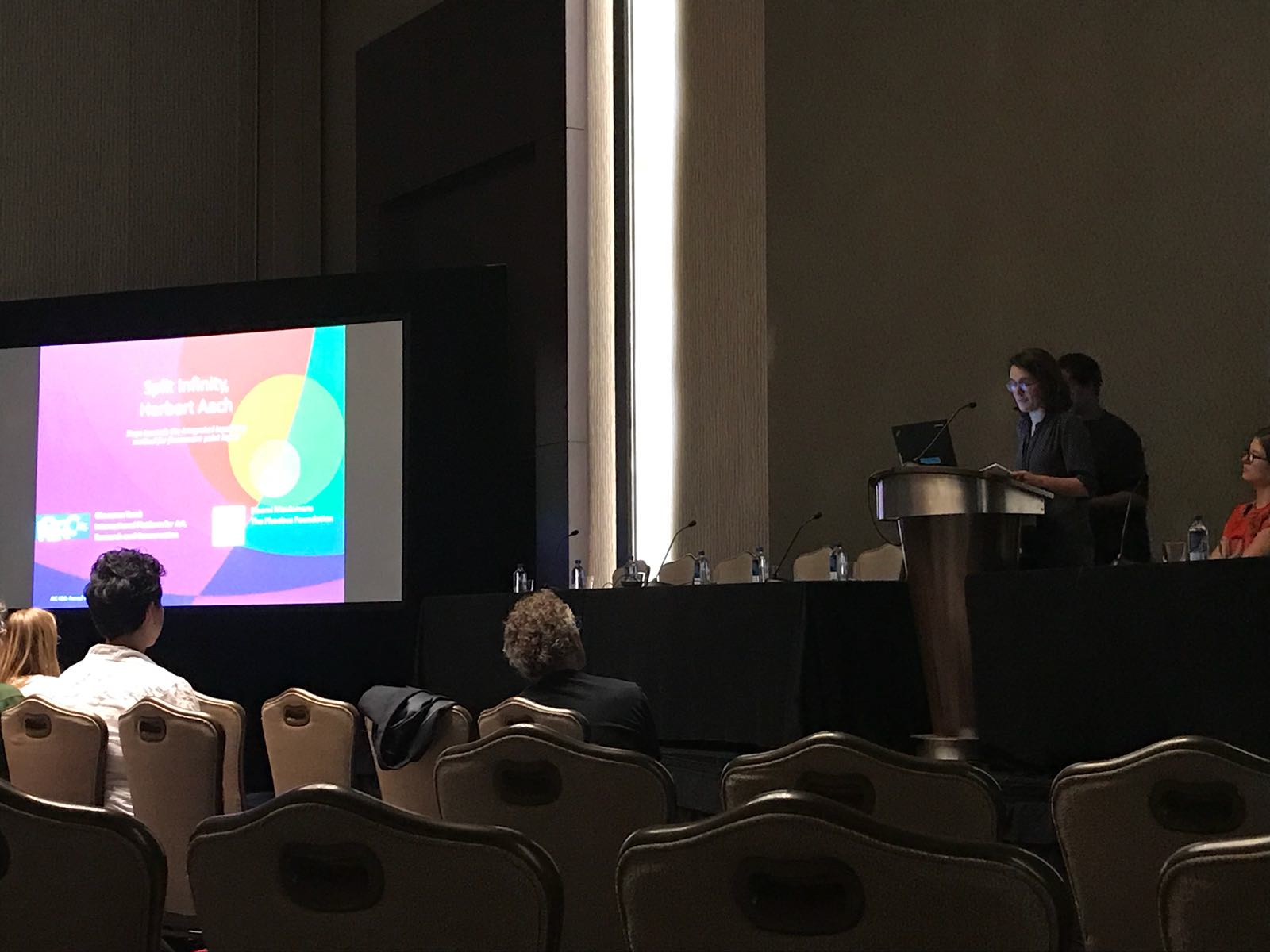
Giovanna Tamà and Naomi Meulemans developed a material-technical study following the restoration of the painting Split Infinity (1977) by Herbert Aach (1923 -1985) and the doctoral research of Stefanie De Winter (‘When Art Turned Day-Glo: Marking the Impact of Daylight Fluorescent Materials in New York Art from the 60s and 70s’). In the spring of 2018 an intensive research project was started on the conservation and protection of fluorescent paint layers.
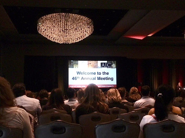
Not only was fluorescent paint decomposed into its composition, attention was also paid to its ageing properties. The aim was to extend the life span of the fluorescence, to protect this type of paint against natural damage phenomena and to develop a suitable retouching method over time. The AIC, American Institute for Conservation selected this research for a presentation at their annual congress held in Houston, Texas (USA) in 2018.
Thanks to the AIC Annual Meeting, the largest conference on conservation and restoration in North America, the conservators had the opportunity to make a trip to the United States.
The meeting was held at the Marriott Marquis Hotel in downtown Houston, Texas from 29 May to 2 June 2018. The theme of the event was Material Matters. It was also here that research on retouching fluorescent paint was presented and shared with the many other curators and researchers.
Research
Although the conservation of modern paintings (ca. since 1945) is very different from the conservation treatments of old masters, within the group of modern works of art an enormous evolution in conservation methods can be observed. A painting that complies with traditional painting techniques but was painted with new, self-composed paint will show a very different aging phenomenon than works that were not painted traditionally but with traditional types of paint. (e.g. with a palette knife, without the use of primers)
The way in which a painting is built up and with which specific materials is therefore very decisive for the quality of the paint layer. The paintings we discuss belong mainly to the first group which allows us to focus on the use of paint materials, in this case fluorescent paint, and not so much on the painting techniques.
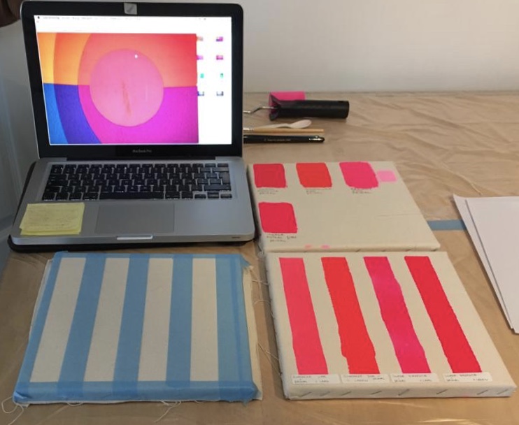
While preserving Herbert Aach’s (1923-1985) Split Infinity series (1976-77) fluorescent monochrome paintings, the standard retouching methods led to negative results. So far we were able to simulate the fluorescent color under stable light conditions, but as soon as the ultraviolet light increased, the retouching became disturbingly visible. In addition to these difficulties in matching the colour tones, the structure of the material differed greatly from the original paint layer, giving a visibly uneven effect.

A total of one year was spent on the analysis of various binders and pigments that can be used in the restoration of fluorescent paint layers.
Herbert Aach was an artist who made his own pigments and paint media. The fluorescent paint layers in the Split Infinity series look very dry and fresco-like and the saturation of the fluorescent pigment in the acrylic medium is much higher than the fluorescent paint sold in shops for art supplies. Herbert Aach was thus able to increase his paint quality by composing it himself.
Three significant characteristics became clear during this empirical comparison: first, fluorescent pigments age much faster than conventional pigments; after 10 years they begin to lose their intensity. Secondly, they are highly transparent due to their organic pigment composition, which means that they cannot be mixed with other non-fluorescent colours.
Thirdly, there are limits to the binding of fluorescent pigments with media because they require a very bright medium due to their high transparency. This study looked for a new retouching method that takes these specific characteristics into account and that makes it possible to paint with fluorescent pigments in the monochrome, fresco-like paint layers of Aach’s works.
A total of one year was spent on analysing various binders and pigments that can be used in the restoration of fluorescent paint layers. These tests are also closely monitored and to this day checked for ageing effects.
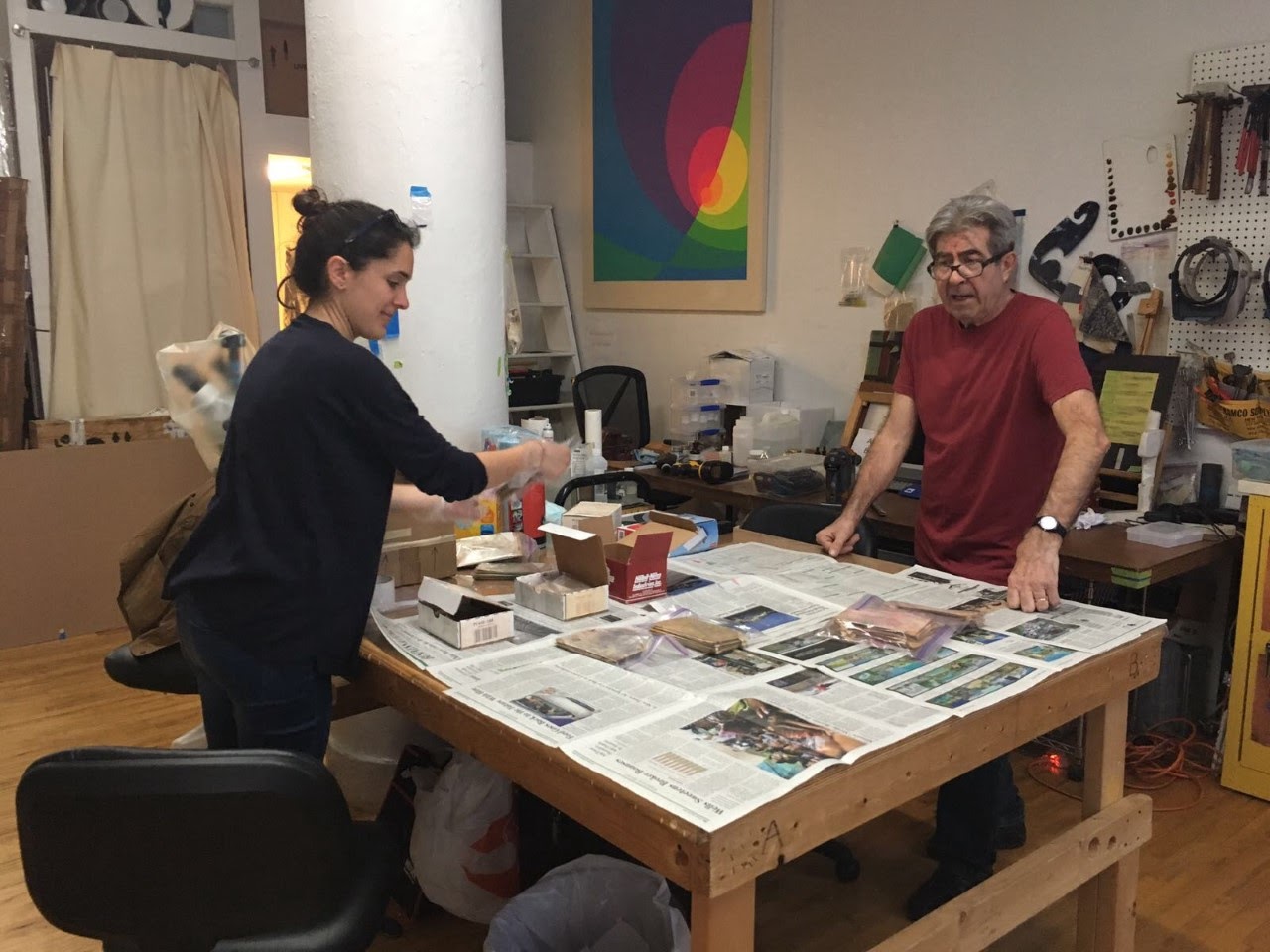
Hand crafted pigments, still available from Herbert Aach, were collected in New York where the artist’s widow Doris Aach invited us into her home. The experience of discovering more and more of the artist’s works was overwhelming. The many paintings, present in the apartment, had the same power and energy as the painting that was restored in Belgium. The pigments, carefully maintained by Doris, were collected in collaboration with restorer Luca Bonetti and packed for further research in Belgium. This unique experience became certainly a great value to the research.
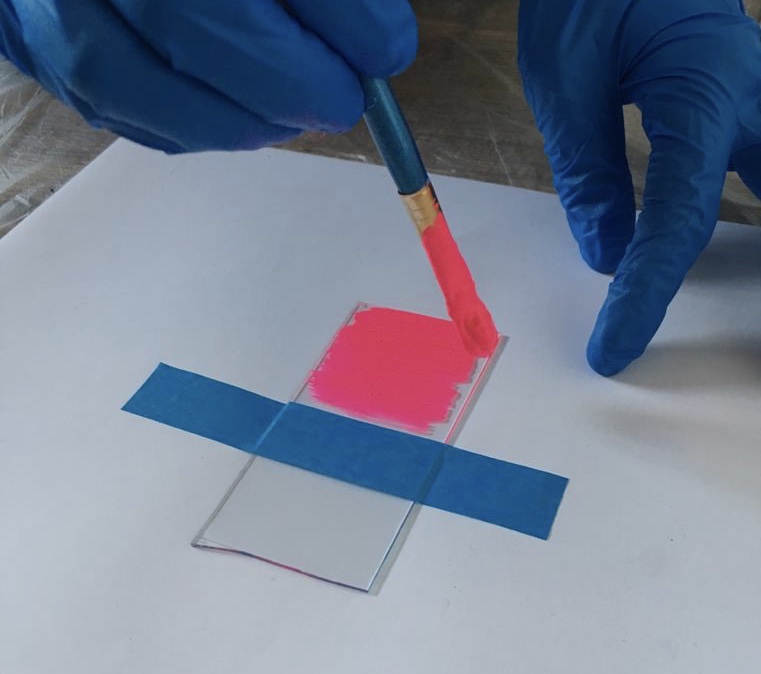
The retouching tests, which were gradually developed in Belgium, were artificially aged and checked for resilience, colour fastness and fluorescence. All this was mapped out together with the scientific institute ‘Royal Institute for Cultural Heritage’ (KIK/IRPA Brussels). This made it possible to reduce the number of options for inpainting and treating damaged fluorescent paint layers to three potential paint combinations.
D-DAY – The AIC Annual Meeting
The meeting, which brings together more than 1,000 participants from different parts of the world, focused that year on material research and the emergence of innovative treatment/techniques and new ways of “looking”. Ideal for this fluorescent pigment research to be launched within the conservation world in order to further acquire and share knowledge.
On the basis of examples and test results from the KIK-IRPA, the lecture discussed which approach can be innovative and effective for the preservation of fluorescent paint layers. Various aging tests were explained and we discussed which binders and pigments were effective. It soon became clear that the same problems were present in many art collections.
In addition to the many lectures, numerous guided tours, walking tours and workshops were organized. The Houston Downtown walking tour, a guided tour of Houston’s most prominent buildings and architecture, and a tour of the new restoration studio and depot of the Texas A&M Library gave a glimpse behind the scenes of what first seemed like a static city. To our amazement there was not only a fantastic array of art to discover, but we met many fascinating researchers in the heart of warm Texas .

Kremer Water Color Set Fluorescent Colors Houston Down Town Texas A&M Library


In the exhibition hall of the AIC conference it is the time to network and share ideas and results. New innovative materials were on display, such as those from KremerPigments, where we were able to test the ‘Kremer Watercolor Set Fluorescent Colors’, which may apply to our further research. Golden Colours also had an overlap with our research area in Daylight Fluorescent Paint. Sharing each other’s knowledge helped us broaden our vision and opportunities to repair and retain highly sensitive fluorescent paints in the future.
Want to know more about fluorescent pigments? Read more about the restoration and research of the painting ‘Bampur’ by Frank Stella here.
For more information about the research and restoration of Split Infinity, Herb Aach please feel free to contact us via info@privatearttours.be.
Research and restoration of ‘Self-portrait’, Permeke, 1928-1936, Oostende, MuZee
Although I looked up at the expressionist artists in 1936, I was already able to see with my own eyes how quickly their work was materially lost. I am reminded of the many cracks of Philibert Cockx’s over-applied crunch, the browns of Permeke, etc.
René Smits in Flanders Magazine, 1983
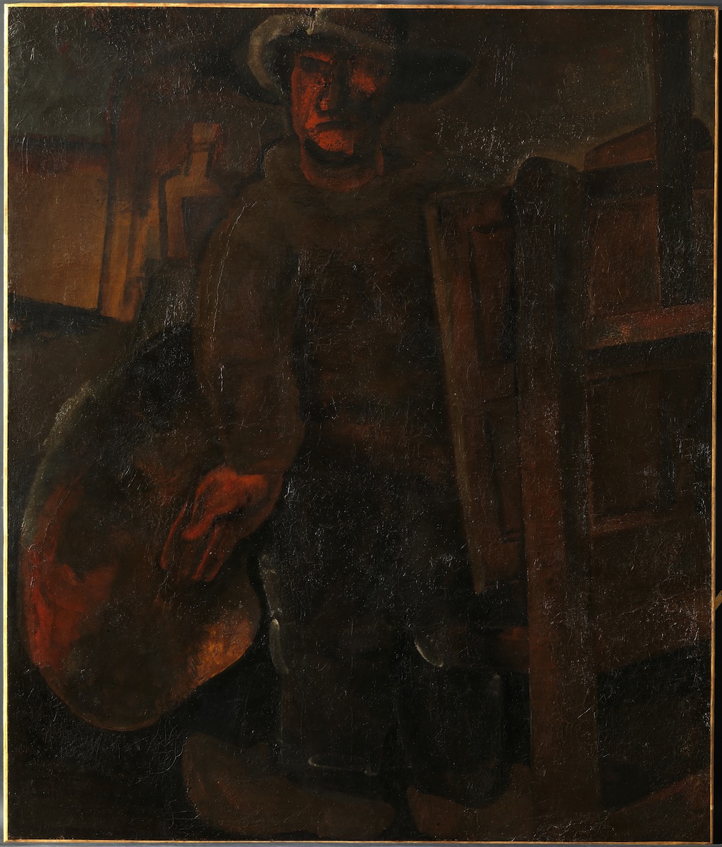
The painting that was restored at KIK-IRPA is a self-portrait of the painter Constant Permeke, which he painted in 1928. Eight years later he resumed large parts of the work, repainting entire zones. He worked further on the composition and the forms, resuming the face, the shoes and much of the background. The figure with hat stands behind an easel, wears clogs and he holds a brush and a palette in his right hand. The tone of the work is very dark, the artist almost exclusively used brown earth pigments here. Only the face, the right hand and the palette have a brighter, red color
A painter must stand with his feet in the shit.
C. Permeke
Over the years, the painting has already undergone some restoration treatments; including a consolidation and duplication using wax resin. The most important problem of the work was the flaking of the pasty paint layer. The paint is highly crackled over the entire surface and showed large cracks, shrinkage cracks and ripple. In addition, the whole was covered by a lot of dirt and a thick layer of dust.
The work came into the Institute because the paint layer had dangerous back-ups. A preliminary investigation was carried out into the most suitable fixative that was tested through small tests. The paint was fixed and surface dirt was removed. The gaps were filled in again with a suitable filling and retouched.
Parallel to the treatment, a few analyzes were performed to try to find out the problem of exfoliation. Within the framework of the project, 12 other paintings by Permeke from the Mu.ZEE collection with the same problem were additionally investigated.
Permeke painted spontaneously and very quickly. The paint was applied thick and very sloppy, possibly directly from the tubes either with a palette knife, wide brushes or with his thumbs and fingers. He felt intimately connected to the ground and therefore used many brown and dark colors.
In this way he referred to the earthly, popular and ordinary life of the simple person, such as the farmer and the fisherman. On the other hand, earth pigments were cheap and easily available.
The fact that Permeke knew little about painting techniques does not detract from the greatness of his artistry.
René Smits in Flanders Magazine, 1983
Permeke was an expressive painter who adapted his method and technique in many different ways. He painted over and renamed much of his work. This has the logical consequence that his layers of paint are made up of many different layers, at “The Self-Portrait” at least thirteen.
During his life, he was already known for his unique choice of materials and techniques. This already produced degradation phenomena, of which he may have been aware.
The works of the painter generally have a very dark view. An important question here is: Has Permeke intentionally darkened his paintings or is this the result of natural aging or the painter’s painting technique?
The research gave us some striking technical aspects as a result. It allows us to better understand Permeke’s painting technique and offers more clarity about layer construction, so that restoration treatments can be better tailored to the needs of the work in the future.
From the exhibition “Permeke in layers”, 25.04.2015 – 16.08.2015, Mu.Zee Ostend.
Both the research and the restoration of the Self-portrait were carried out by the Royal Institute for the Art Heritage (KIK-IRPA) in Brussels.
Vogel, Karel Appel (1921-2006) and the Myth of the Making
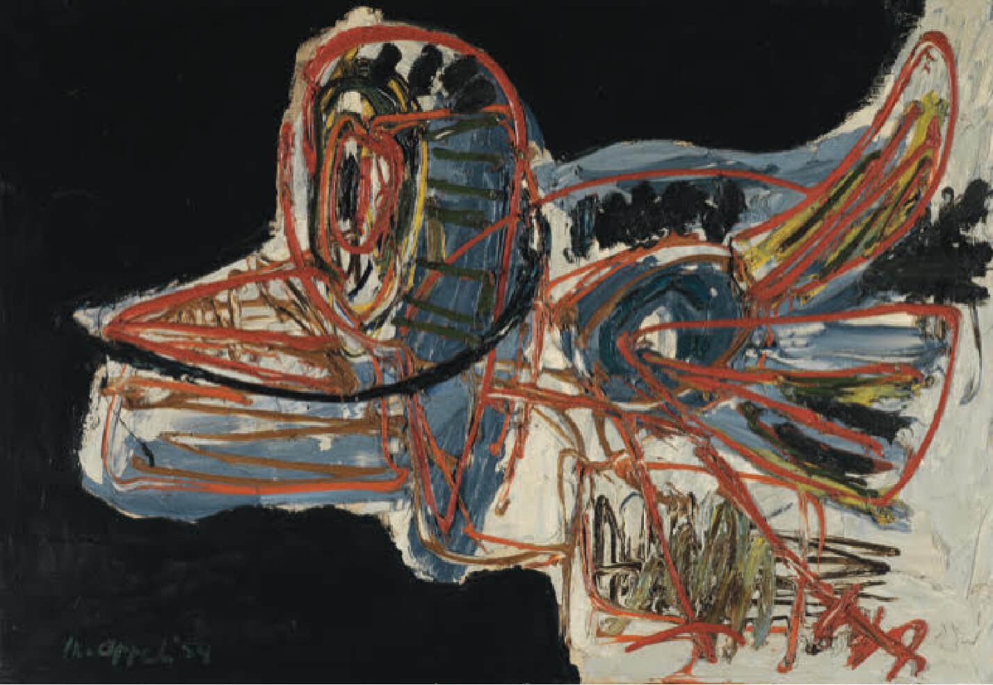
A silhouette against a black shiny background, in the shape of a simple bird. Vivid lines, but seemingly dull colors.
Karel Appel (1921-2006), one of the most important members of the CoBrA group, produced this work in 1954, as the signature and dating on the lower left give away: K.Appel’54. Appels Vogel, which is part of the extensive CoBrA collection of The Phoebus Foundation, stimulates curiosity. Did the Amsterdammer paint this figure as spontaneously as a child draws on a sheet of paper – which the CoBrA movement was proud of – or is there more to it?
An in-depth study of the paint layers of Apple’s composition provides innovative insights into the working methods of this experimental artist and offers important tools for preserving and restoring his oeuvre. Because of the unconventional use of materials, the fragile Vogel cannot be treated with traditional restoration techniques.
The canvas aptly illustrates the wealth of information the artwork itself reveals by combining careful analysis with the naked eye with advanced recording technologies.
Paint layers tell so much more than you would think at first sight.

From the publication: Vogel, Karel Appel (1921-2006) and the Myth of the Making
Publisher: Phoebus Focus XIV
Author: Naomi Meulemans
ISBN 978 94 638 8334 4
D/2019/14.672/11